
(This article by Dr Nic was originally published at Learn and Teach Statistics and Operations Research.)
I don’t believe in learning styles. The idea of visual, audio, tactile and kinaesthetic learners has been popular in the last decade, but has done a great disservice to many learners labelled “kinaesthetic” and left to play with the blocks in the corner. So when a person tells me they are a visual learner, in the same defining tone they would use to state their height or eye color, I wince inside.
What I do believe is that effective learners use many different ways to learn, and for most of us a well-thought-out diagram will help in understanding and retaining new knowledge.
I love diagrams, but call me a visual learner and I will be tempted to slap you. I also like to have things explained out loud, and I like to try things for myself, and I really like to make and eat cookies. None of those things define me.
But I do love diagrams.
Explaining the p-value with diagrams
Diagrams should either be correct and understandable, or a useful metaphor. Do a Google search for a picture to represent a p-value and you will get a screen full of bell curves with little shady bits in one or both tails. For the 99% of the population learning about p-values, this is USELESS! They do not understand what the curve represents, let alone the shady bit in the corner or its relationship to the p-value. So give it up.

Results of a Google search for images of the p-value
In making a video about the p-value, I wanted some useful pictures that would help people to understand and remember how to use a p-value. Videos without pictures are rather missing the point. Most students aren’t ready yet to know where the p-value comes from, so my aim is for them to use it correctly.

The personification of hypotheses and the p-value
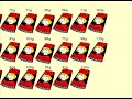
So I came up with a metaphor involving little people representing the Null and Alternative hypotheses and a big (or small) yellow letter P. This develops a memorable mental representation when the poor null hypothesis keeps getting rejected. You can see this in the video, Understanding the p-value.
Diagrams for teaching percentages
As part of the Quantitative Methods for Business course we teach percentages. These are surprisingly tricky. We include questions like “A lawyer’s bill came to $4167.60 including GST (Goods and Services Tax) of 15%. How much was the GST component?”
After several years of teaching and helping students, I decided we needed a diagram. After considerable thinking I produced this.

Students love this!
Students find the diagram really useful for dealing with just about any percentage question. I teach them how to construct the diagram for answering questions about increasing and decreasing by a percentage. It is gratifying to see them drawing their own diagrams to answer questions.
Visual images in teaching Linear Programming
Most teachers of LP like to start with the two decision variables to teach Linear Programming. This way it can be drawn on a Cartesian plane. This is great for maths and engineering students who are at home on the Cartesian plane. It is really good for understanding shadow prices and binding and slack constraints. However for business students, we found this added an extra level of incomprehension.

A consistent, logical LP layout helps learning
For this reason we go straight to the spreadsheet model, and standardise the look of an LP. This helps them to gain a visual image of an LP, with objective function, decision variables, and constraint values in different colours. It is worth thinking about whether the Cartesian plane with a trivial example is right for your students.
Disclaimer
Like most of the claims about learning styles, the ideas expressed in this post are not based on empirical research. However, they are the result of over twenty years of teaching and reflection, and this is a blog, not a peer-reviewed journal article. 


Please comment on the article here: Learn and Teach Statistics and Operations Research
