(This article was originally published at The DO Loop, and syndicated at StatsBlogs.)
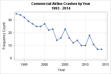
There has been a spate of recent high-profile airline crashes (Malaysia Airlines, TransAsia Airways, Germanwings,...) so I was surprised when I saw a time series plot of the number of airline crashes by year, which indicates that the annual number of airline crashes has been decreasing since 1993. The data show that the annual number of crashes in recent years is about half of the number from 20 years ago.
A flow diagram that visualizes airline crash data
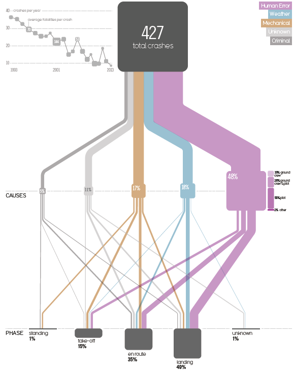
The series plot appeared in Significance magazine as part of an interview with designer David McCandless, who produces infographics about data. McCandless has recently published a new book titled Knowledge is Beautiful, which includes the following infographic (click to enlarge). The time series plot appears in the upper left. The main portion of the infographic presents information about the causes of commercial air crashes from 1993–2013. In addition to the cause of the crash, McCandless shows the "phase of flight" (take-off, en route, landing) during which the disaster occurred.
In general, infographics are designed to appeal as well as to inform. In the article, McCandless says that he is trying to show "the links, connections and relations between things." His goal is to "mediate between the data and the audience" so that people "pay attention" to the data. Many statisticians share that goal, with a possible difference being that statistical graphics attempt to objectively represent the data so that the data speak for themselves.
McCandless's goal is to create beautiful infographics (and he has succeeded!), but I would like to propose an alternative visualization of these data that trades beauty for compactness.
I have two main issues with McCandless's "flow diagram," which is reminiscent of a Sankey diagram. The first is that it uses a lot ink to display the relationship between "Cause" and "Phase," which are each five-level categorical variables. A standard frequency analysis would display this data in a 5x5 table or visualize it with a tile-based plot with 25 tiles. I don't think that Edward Tufte would approve of Mccandless's plot. Unlike Tufte's favorite plot—Minard's Napolean's March to Moscow", which uses a similar design—there is no temporal or geographic change for these data. The "flow" through the various "pipes" merely represents conditional frequencies.
My second objection is simply that some of the blocks in the diagram are the wrong sizes. The area of the blocks is supposed to be proportional to the number of crashes in each category. Notice that the bottom row is properly scaled: If you stack the "take-off" and "en route" boxes, which account for 50% of the cases, they approximately equal the area of the "landing" box. However, some boxes are not proportional to the frequency that they represent:
- The top block represents 100% of the crashes, but its area is too big compared to the cumulative areas of the blocks in the "Causes" or "Phase" row.
- The "Human Error" block (48%) is too big within its row. The other blocks on the "Causes" row account for 51% of the cases, so the sum of their areas should be greater than the area of the "Human Error" block.
- The "Human Error" block (48%) is too big across rows. It is much larger than the "Landing" block in the bottom row, which represents 49% of the cases.
Visualizing airline crashes with a mosaic plot
At the risk of building a glass house after hurling those stones, I suggest that a mosaic plot is a standard statistical graphic that can display the same air crash data. You can download the data from McCandless's web site. The data needs a little data cleansing before you can analyze it, and I have provided my SAS program that creates the mosaic plot and other related plots. McCandless's diagram uses data through mid-2013, whereas the mosaic plot uses data through March 2015.
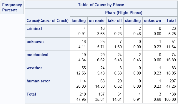
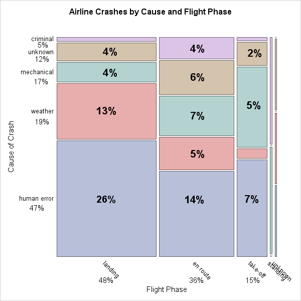
Many SAS procedures use ODS statistical graphics to display graphs as readily as they display tables. For example, the following call to PROC FREQ creates a 5x5 frequency table (click to see the table) and a mosaic plot:
proc freq data=Crash order=data;
tables Cause*Phase / plots=(mosaic(square));
run;
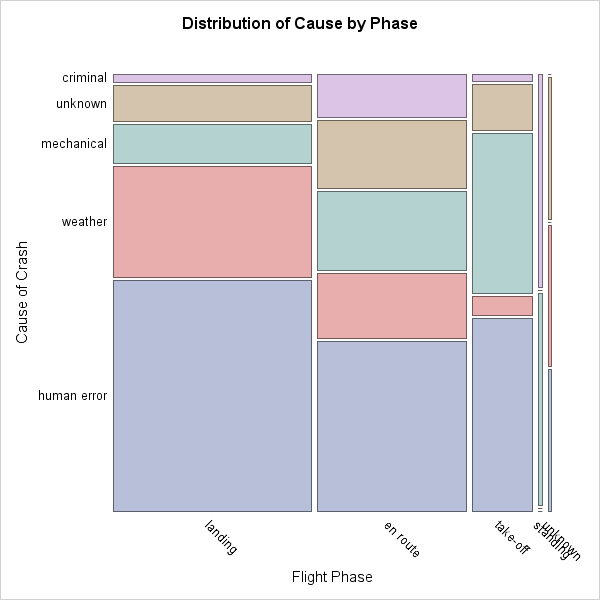
In a mosaic plot, the area of each tile is proportional to the number of cases. I have ordered both variables according to frequency, whereas McCandless ordered the "Phase" variable temporally (standing, take-off, en route, landing). I did this so that the most important causes and phases appear in the first row (bottom) and first column (left). The relative widths of the columns indicate the relative frequency of the one-way frequencies for the "Phase" variable. Colors connect the categories for the "Cause" variable.
The mosaic plot is far from perfect. It is hard to visually trace the categories for the "Cause" variable. For example, finding the "mechanical" category for each flight phase requires some eyeball gymnastics. Also, although the mosaic plot makes it possible to visualize the proportions of crashes for each cause and phase, the absolute frequencies are not available on the graph by default. The frequency counts are available in the 5x5 table that PROC FREQ produces. Alternatively, with additional effort you can create a mosaic plot that includes frequency counts for the largest mosaic tiles, which I think is far superior to the default display.
What do you think? Do you prefer the mosaic plot that is produced automatically by PROC FREQ, the one with frequency counts, or do you prefer McCandless's flow diagram? Which helps you to understand the causes of airline crashes? Feel free to adapt my SAS program and create your own alternative visualization!
The post Visualizing the causes of airline crashes appeared first on The DO Loop.
Please comment on the article here: The DO Loop