
(This article was originally published at Statistical Modeling, Causal Inference, and Social Science, and syndicated at StatsBlogs.)
After our discussion of visual displays of regression uncertainty, I asked Solomon Hsiang and Lucas Leeman to send me their code. Both of them replied.
Solomon wrote:
The matlab and stata functions I wrote, as well as the script that replicates my figures, are all posted on my website.
Also, I just added options to the main matlab function (vwregress.m) to make it display the spaghetti plot (similar to what Lucas did, but a simple bootstrap) and the shaded CI that you suggested (see figs below). They’re good suggestions.
Personally, I [Hsiang] like the shaded CI better, since I think that all the visual activity in the spaghetti plot is a little distracting and sometimes adds visual weight in places where I wouldn’t want it. But the option is there in case people like it.

Solomon then followed up with:
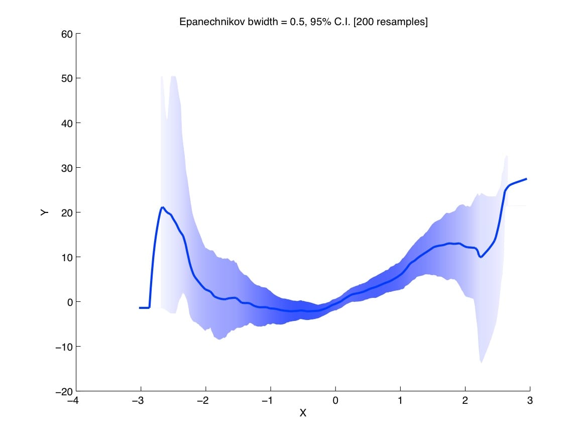
I just thought of this small adjustment to your filled CI idea that seems neat. Cartographers like map projections that conserve area. We can do something similar by picking a visual-weighting scheme that conserves “ink” (which we equate with confidence). Imagine that we squirt out ink uniformly to draw the conditional mean and then smear the ink vertically so that it stretches from the lower confidence bound to the upper confidence bound. In places where the CI band is narrow, this will cause very little spreading of the ink so the CI band will be dark. But in places where the CI band is wide, the ink is smeared a lot so it gets lighter. For any vertical sliver of the CI band (think dx) the amount of ink displayed (integrated along a vertical line) will be constant. But in places where we have a lot of information, the display will have more visual weight. I think this is a somewhat more natural visual-weighting scheme for the CI band than the 1/sqrt(N) that I was using for just the mean regression. I’ve attached both for comparison.
After thinking a little more about how to visually-weight the CI bands and the spaghetti plots, I think that maybe we should be careful not to “double count” uncertainty. For example, when the estimates begin to spread out in the spaghetti plots, then the apparent coloration begins to thin out simply because there is a lower density of lines. So if we *also* fade out the lines, then we’re dimming the uncertain regions in two ways. This isn’t obviously wrong, but it does feel like we’re penalizing the graph in uncertain regions twice for the same thing.
Plotting the CI band with the “fixed ink” visual-weighting and the spaghetti plot with solid spaghetti seem like analogs to one another, since the vertically integrated quantity of ink is uniform in both plots. Commands to plot both (using the function I posted) are:
x = randn(200,1);e = 4*randn(200,1).*(1+abs(x)).^1.5;
y = 2*x+x.^2+e;
figure
%"Fixed-ink" visual weighting:
vwregress(x, y, 300, .5,'CI','FILL',200,[0 0 1]);
figure
%Solid spaghetti plot without visual weighting:
vwregress(x, y, 300, .5,'SPAG','SOLID',200,[0 0 1]);
My reply:
I know what Solomon is saying about the double-counting; I thought about this too in my original post, which is why I’d liked the idea of the spaghetti plot with additive shading. Ultimately much depends on what these plots look like in real examples. One problem I have with many traditional statistical summaries (such as 95% intervals, whether presented graphically or as numbers in table or text) is that they emphasize the borders of the intervals. The edge of a 95% interval is not so interesting; it’s a noisy data summary.
The status quo in many fields is even worse than that, though, in that it is often standard to put little perpendicular lines at the edges of intervals to make “error bars” which emphasize the endpoints even more.
Meanwhile Lucas also responded to my request for code:
The original plot is based on a nested model with data I cannot make available. But I have here some sample code in R which will produce a similar plot:
# Example with Probit

library(mvtnorm)

set.seed(111)

x <- rnorm(1000)						#	systematic component

e <- rnorm(1000, sd=18)					#	random component

y.lat <- 3*x+e							#	latent scale

y <- rep(0,1000)

y[y.lat>0] <- 1							# 	observed outcome variable

mod1 <- glm(y ~ x, family = binomial(link = "probit"))

beta1 <- coef(mod1)

var1 <- vcov(mod1)

split <- 30								# spacing of x

BETA1 <- rmvnorm(200, beta1, var1)		# Taking 1000 drwas of the posterior vector

xx1 <- seq(-10,10,length.out=split)			# The x-range you want to use for plotting later

X1 <- cbind(1,xx1)						# The Matrix of explanatory variables where

										# 	>one variable varies from row to row

y.lat1 <- BETA1%*%t(X1)					# 1000 rows (uncertainty) and 500 columns

										# 	>(for different values of x)

#y.lat2 <- t(apply(y.lat1,1,sort))			# Sorting to cut off alpha %

y.lat2 <- y.lat1

y.pred <- pnorm(y.lat2)					# translate latent to predicted probability

cib <- 0.1								# Define level for CI

lb <- round((dim(BETA1)[1] * cib)/2)	# lb and ub define which predictions to be plotted

ub <- dim(BETA1)[1] - lb 				#  >and are based on "cib"
# plot the median prediction
plot(xx1,colMeans(y.pred), type="l", col=rgb(160,32,240,255,maxColorValue=255), lwd=3, yla="Predicted Prbablity", xlab="Variable xx1")
for (i in lb:ub){ # plot every prediction between "lb" and "ub"
# >the denominator for the alpha (here: 18) and
# >the line thickness (lwd) are easy to change to
# >get different shades
points(xx1,jitter(y.pred[i,], factor=4), type="l", col=rgb(160,32,240,(255-abs(round(dim(y.pred)[1]/2)-i))/9,maxColorValue=255), lwd=2)
}
Please comment on the article here: Statistical Modeling, Causal Inference, and Social Science
