One piece of advice I give for those wanting to get into data visualization is to trash the defaults (see the last part of this interview with me). Jon Schwabish, an economist with the government, gives a detailed example of...

One piece of advice I give for those wanting to get into data visualization is to trash the defaults (see the last part of this interview with me). Jon Schwabish, an economist with the government, gives a detailed example of...
On Twitter, Andy C. (@AnkoNako) asked me to look at this pretty creation at NFL.com (link). There is a reason why you don't read much about spider charts (web charts, radar charts, etc.) here. While this chart is beautifully constructed,...

Update on July 15, 2013: Thanks to Harlan Nelson for noting on AnalyticBridge that the ozone concentrations for both New York and Ozonopolis are non-negative quantities, so their kernel density plot should have non-negative support sets. This has been corrected in this post by - defining new variables called max.ozone and max.ozone2 - using the […]

Introduction Continuing my recent series on exploratory data analysis (EDA), and following up on the last post on the conceptual foundations of empirical cumulative distribution functions (CDFs), this post shows how to plot them in R. (Previous posts in this series on EDA include descriptive statistics, box plots, kernel density estimation, and violin plots.) I […]

For the sake of brevity, this post has been created from the first half of a previous long post on kernel density estimation. This first half focuses on the conceptual foundations of kernel density estimation. The second half will focus on constructing kernel density plots and rug plots in R. Introduction Recently, I began a […]
I shouldn't be surprised by this. No sooner did I sing the praise of Significance magazine (link) than a reader sent me to some charts that are not deserving of their standard. Here is one such chart (link): Quite a...
Ken B., another Australian reader, wasn't too proud of this effort, apparently excerpted from an HSBC report by the Sydney Morning Herald (link): Ken: If you plot ranking by ranking it magically turns into a straight line. *** There are...
One of the best charts depicting our jobs crisis is the one popularized by the Calculated Risk blog (link). This one: I think a lot of readers have seen this one. It's a very effective chart. The designer had to...
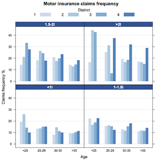
Lattice plots are a great way of displaying multivariate data in R. Deepayan Sarkar, the author of lattice, has written a fantastic book about Multivariate Data Visualization with R [1]. However, I often have to refer back to the help pages to remind m...
Lattice plots are a great way of displaying multivariate data in R. Deepayan Sarkar, the author of lattice, has written a fantastic book about Multivariate Data Visualization with R [1]. However, I often have to refer back to the help pages to remind m...
