Posts Tagged ‘ dotplot ’

A helpful structure for analysing graphs

April 22, 2014
By
A helpful structure for analysing graphs

Mathematicians teaching English “I became a maths teacher so I wouldn’t have to mark essays” “I’m having trouble getting the students to write down their own ideas” “When I give them templates I feel as if it’s spoon-feeding them” These … Continue reading →

Read more »

A helpful structure for analysing graphs

April 22, 2014
By
A helpful structure for analysing graphs

Mathematicians teaching English “I became a maths teacher so I wouldn’t have to mark essays” “I’m having trouble getting the students to write down their own ideas” “When I give them templates I feel as if it’s spoon-feeding them” These … Continue reading →

Read more »

The Extra Step: Graphs for Communication versus Exploration

January 12, 2014
By
The Extra Step: Graphs for Communication versus Exploration

Visualization is a useful tool for data exploration and statistical analysis, and it’s an important method for communicating your discoveries to others. While those two uses of visualization are related, they aren’t identical. One of the reasons that I like ggplot so much is that it excels at layering together multiple views and summaries of […] Related posts: Revisiting Cleveland’s The Elements of Graphing Data in ggplot2 My Favorite Graphs…

Read more »

Replication of few graphs/charts in base R, ggplot2, and rCharts

November 7, 2013
By

UPDATE: THE BLOG/SITE HAS MOVED TO GITHUB. THE NEW LINK FOR THE BLOG/SITE IS patilv.github.io and THE LINK TO THIS POST IS: http://bit.ly/1jJ6f7v. PLEASE UPDATE ANY BOOKMARKS YOU MAY HAVE.In this post, I use a simulated dataset (7 variables -3 factor a...

Read more »

Lilac Bloomsday Run in Graphs

July 18, 2013
By
Lilac Bloomsday Run in Graphs

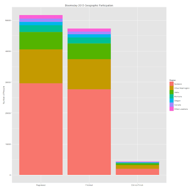
UPDATE: THE BLOG/SITE HAS MOVED TO GITHUB. THE NEW LINK FOR THE BLOG/SITE IS patilv.github.io and THE LINK TO THIS POST IS: http://bit.ly/1obWRer. PLEASE UPDATE ANY BOOKMARKS YOU MAY HAVE. The Lilac Bloomsday Run is a 7.46 miles (12 kms) rac...

Read more »

Visualizing a tiny slice of India’s demographics with information from Wikipedia

July 10, 2013
By
Visualizing a tiny slice of India’s demographics with information from Wikipedia

UPDATE: THE BLOG/SITE HAS MOVED TO GITHUB. THE NEW LINK FOR THE BLOG/SITE IS patilv.github.io and THE LINK TO THIS POST IS:http://bit.ly/1ib8wTl .  PLEASE UPDATE ANY BOOKMARKS YOU MAY HAVE.This post presents a tiny slice of a complex and...

Read more »

Interacting, on demand, with 2012 best cities data and plotting different graphs —- Experiments with ggplot2 on shiny server

April 25, 2013
By
Interacting, on demand, with 2012 best cities data and plotting different graphs —- Experiments with ggplot2 on shiny server

UPDATE: THE BLOG/SITE HAS MOVED TO GITHUB. THE NEW LINK FOR THE BLOG/SITE IS patilv.github.io and THE LINK TO THIS POST IS:http://bit.ly/1vRPV8h .  PLEASE UPDATE ANY BOOKMARKS YOU MAY HAVE.Data from slides on Bloomberg bus...

Read more »

Motivating Students

April 13, 2013
By
Motivating Students

UPDATE: THE BLOG/SITE HAS MOVED TO GITHUB. THE NEW LINK FOR THE BLOG/SITE IS patilv.github.io and THE LINK TO THIS POST IS:http://bit.ly/SrQK8k .  PLEASE UPDATE ANY BOOKMARKS YOU MAY HAVE.Figure shown to students in a part...

Read more »


Subscribe

Email:

  Subscribe