Blog Archives

Why aren’t all of our graphs interactive?

March 16, 2013
By
Why aren’t all of our graphs interactive?

I’ve come to believe that, for high-dimensional data, visualizations (aka graphs), and particularly interactive graphs, can be more important than precise statistical inference. We first need to be able to view and explore the data, and when it is unusually abundant, that is especially hard. This was a primary contributor to my recent embarrassments, in […]

Read more »

Towards making my own papers reproducible

March 10, 2013
By
Towards making my own papers reproducible

Much has been written about reproducible research: that scientific papers should be accompanied by the data and software sufficient to reproduce the results. It’s obviously a Good Thing. But it can be hard to stick to this ideal in practice. For my early papers, I’m not sure I can find the materials anymore, and that’s […]

Read more »

Interactive eQTL plot with d3.js

March 6, 2013
By
Interactive eQTL plot with d3.js

I just finished an interactive eQTL plot using D3, in preparation for my talk on interactive graphics at the ENAR meeting next week. The code (in CoffeeScript) is available at github. But beware: it’s pretty awful. The hardest part was setting up the data files. Well, that plus the fact that I just barely know […]

Read more »

Interactive MA plot

February 11, 2013
By
Interactive MA plot

The New York Times has an interesting interactive graphic on boys’ and girls’ average scores on a science exam, by country. It’s nice to see a scatterplot. (Often one would see just a bar plot, with female and male bars side-by-side.) Even better, this is an “MA plot.” That is, rather than just plot males […]

Read more »

Interactive graphics with d3.js

February 8, 2013
By
Interactive graphics with d3.js

I’m making some progress learning D3 (for interactive graphics), by which I mean I’ve gotten a couple of examples to work. Many box plots First, an example for displaying many distributions. Here I’m considering a set of nearly 500 gene expression microarrays, each with 40,000 or so measurements. It’s hard to look at 500 box [...]

Read more »

Microsoft Office

January 30, 2013
By
Microsoft Office

The New York Times has an article about how Microsoft will have users pay a yearly fee for MS Office, instead of buying it outright. There’s some mention of competition from Google Docs. Why should one still use Microsoft Office? The brilliant Excel graphs! As for Google, Mr. DelBene said it has not “in any [...]

Read more »

NIH to hire Associate Director for Data Science

January 15, 2013
By
NIH to hire Associate Director for Data Science

See the press release. Eric Green, currently head of NHGRI, has been appointed the Acting Associate Director for Data Science.

Read more »

5/9 data journalists use Excel

January 15, 2013
By
5/9 data journalists use Excel

…if I’ve counted correctly. I’d not heard the term “data journalist” before. It’s nice that they have an open handbook.

Read more »

The Hopkins SPH logo, part 2

November 21, 2012
By
The Hopkins SPH logo, part 2

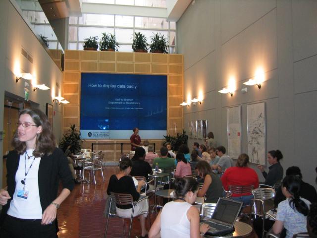
Last week, I wrote about the Johns Hopkins Bloomberg School of Public Health logo. I now present part 2 of the story. Hopkins SPH had done some fancy renovations of part of the building, including an important new feature, the “Wall of Wonder“: a big display composed of nine LCD screens in the atrium of [...]

Read more »

The Hopkins SPH logo, part 1

November 16, 2012
By
The Hopkins SPH logo, part 1

I was just telling a distinguished visitor a few of my various stories about the Johns Hopkins Bloomberg School of Public Health logo. She suggested that it would be a great blog topic. And now that I’m a tenured faculty member at a different university and so can’t get into any [further] trouble over this… [...]

Read more »


Subscribe

Email:

  Subscribe