Posts Tagged ‘ exploratory data analysis ’

Exploratory Data Analysis – All Blog Posts on The Chemical Statistician

Exploratory Data Analysis – All Blog Posts on The Chemical Statistician

This series of posts introduced various methods of exploratory data analysis, providing theoretical backgrounds and practical examples.  Fully commented and readily usable R scripts are available for all topics for you to copy and paste for your own analysis!  Most of these posts involve data visualization and plotting, and I include a lot of detail and […]

Read more »

Exploratory Data Analysis – All Blog Posts on The Chemical Statistician

Exploratory Data Analysis – All Blog Posts on The Chemical Statistician

This series of posts introduced various methods of exploratory data analysis, providing theoretical backgrounds and practical examples.  Fully commented and readily usable R scripts are available for all topics for you to copy and paste for your own analysis!  Most of these posts involve data visualization and plotting, and I include a lot of detail and […]

Read more »

Car crash stats revisited: My measurement errors

November 3, 2014
By
Car crash stats revisited: My measurement errors

Last week, I created revised versions of graphs of car crash statistics by state (including an interactive version), from a post by Mona Chalabi at 538. Since I was working on those at the last minute in the middle of the night, to be included as an example in a lecture on creating effective figures […]

Read more »

Interactive plot of car crash stats

October 31, 2014
By
Interactive plot of car crash stats

I spent the afternoon making a D3-based interactive version of the graphs of car crash statistics by state that I’d discussed yesterday: my attempt to improve on the graphs in Mona Chalabi‘s post at 538. See it in action here. Code on gith...

Read more »

Improved graphs of car crash stats

October 29, 2014
By
Improved graphs of car crash stats

Last week, Mona Chalabi wrote an interesting post on car crash statistics by state, at fivethirtyeight.com. I didn’t like the figures so much, though. There were a number of them like this: I’m giving a talk today about data visualization [slides | github], and I thought this would make a good example, so I spent […]

Read more »

Exploratory Data Analysis: Quantile-Quantile Plots for New York’s Ozone Pollution Data

Exploratory Data Analysis: Quantile-Quantile Plots for New York’s Ozone Pollution Data

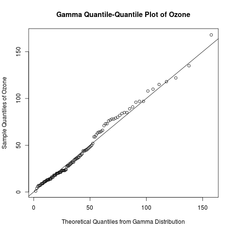
Introduction Continuing my recent series on exploratory data analysis, today’s post focuses on quantile-quantile (Q-Q) plots, which are very useful plots for assessing how closely a data set fits a particular distribution.  I will discuss how Q-Q plots are constructed and use Q-Q plots to assess the distribution of the “Ozone” data from the built-in […]

Read more »

Exploratory Data Analysis: The 5-Number Summary – Two Different Methods in R

Exploratory Data Analysis: The 5-Number Summary – Two Different Methods in R

Introduction Continuing my recent series on exploratory data analysis (EDA), today’s post focuses on 5-number summaries, which were previously mentioned in the post on descriptive statistics in this series.  I will define and calculate the 5-number summary in 2 different ways that are commonly used in R.  (It turns out that different methods arise from […]

Read more »

Exploratory Data Analysis: Combining Histograms and Density Plots to Examine the Distribution of the Ozone Pollution Data from New York in R

Exploratory Data Analysis: Combining Histograms and Density Plots to Examine the Distribution of the Ozone Pollution Data from New York in R

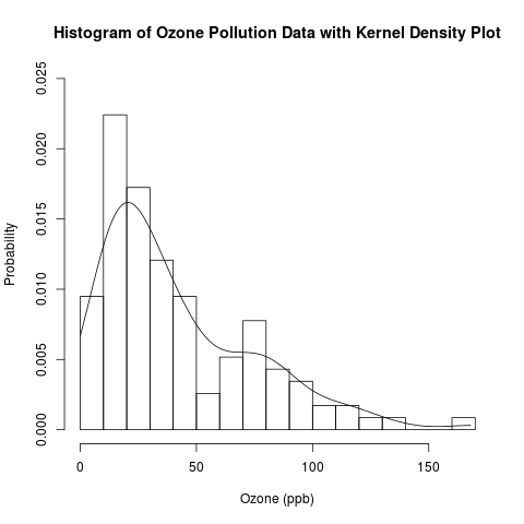
Introduction This is a follow-up post to my recent introduction of histograms.  Previously, I presented the conceptual foundations of histograms and used a histogram to approximate the distribution of the “Ozone” data from the built-in data set “airquality” in R.  Today, I will examine this distribution in more detail by overlaying the histogram with parametric […]

Read more »

Exploratory Data Analysis: Conceptual Foundations of Histograms – Illustrated with New York’s Ozone Pollution Data

Exploratory Data Analysis: Conceptual Foundations of Histograms – Illustrated with New York’s Ozone Pollution Data

Introduction Continuing my recent series on exploratory data analysis (EDA), today’s post focuses on histograms, which are very useful plots for visualizing the distribution of a data set.  I will discuss how histograms are constructed and use histograms to assess the distribution of the “Ozone” data from the built-in “airquality” data set in R.  In […]

Read more »

Exploratory Data Analysis: Conceptual Foundations of Empirical Cumulative Distribution Functions

Exploratory Data Analysis: Conceptual Foundations of Empirical Cumulative Distribution Functions

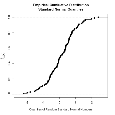
Introduction Continuing my recent series on exploratory data analysis (EDA), this post focuses on the conceptual foundations of empirical cumulative distribution functions (CDFs); in a separate post, I will show how to plot them in R.  (Previous posts in this series include descriptive statistics, box plots, kernel density estimation, and violin plots.) To give you […]

Read more »


Subscribe

Email:

  Subscribe