Posts Tagged ‘ data visualization ’

Jedi master of data: Hans Rosling

November 11, 2013
By
Jedi master of data: Hans Rosling

It has been inspiring to watch how Hans Rosling gave impressive talks about numbers and statistics. If you haven’t seen any of his great presentations, here is one example: Chances are that you probably haven’t seen him showing his wild side before. I just saw this article, “Hans Rosling: the man who makes statistics sing“, […]
Read more »

Detecting Unfair Dice in Casinos with Bayes’ Theorem

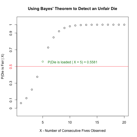
Detecting Unfair Dice in Casinos with Bayes’ Theorem

Introduction I saw an interesting problem that requires Bayes’ Theorem and some simple R programming while reading a bioinformatics textbook.  I will discuss the math behind solving this problem in detail, and I will illustrate some very useful plotting functions to generate a plot from R that visualizes the solution effectively. The Problem The following question is […]

Read more »

Exploratory Data Analysis: Combining Histograms and Density Plots to Examine the Distribution of the Ozone Pollution Data from New York in R

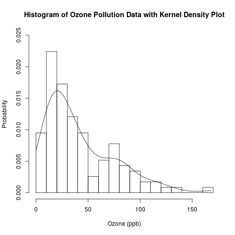
Exploratory Data Analysis: Combining Histograms and Density Plots to Examine the Distribution of the Ozone Pollution Data from New York in R

Introduction This is a follow-up post to my recent introduction of histograms.  Previously, I presented the conceptual foundations of histograms and used a histogram to approximate the distribution of the “Ozone” data from the built-in data set “airquality” in R.  Today, I will examine this distribution in more detail by overlaying the histogram with parametric […]

Read more »

Exploratory Data Analysis: Conceptual Foundations of Histograms – Illustrated with New York’s Ozone Pollution Data

Exploratory Data Analysis: Conceptual Foundations of Histograms – Illustrated with New York’s Ozone Pollution Data

Introduction Continuing my recent series on exploratory data analysis (EDA), today’s post focuses on histograms, which are very useful plots for visualizing the distribution of a data set.  I will discuss how histograms are constructed and use histograms to assess the distribution of the “Ozone” data from the built-in “airquality” data set in R.  In […]

Read more »

The Mechanics of Data Visualization

July 2, 2013
By
The Mechanics of Data Visualization

I recently presented about the mechanics of data visualization at the CLaRI Literacy Conference to a group of researchers, teachers and school administrators. The presentation is based on the work of Few (2012; 2009). While the presentation itself is not about … Continue reading →

Read more »

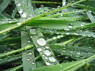
How do Dew and Fog Form? Nature at Work with Temperature, Vapour Pressure, and Partial Pressure

How do Dew and Fog Form?  Nature at Work with Temperature, Vapour Pressure, and Partial Pressure

In the early morning, especially here in Canada, I often see dew – water droplets formed by the condensation of water vapour on outside surfaces, like windows, car roofs, and leaves of trees.  I also sometimes see fog – water droplets or ice crystals that are suspended in air and often blocking visibility at great […]

Read more »

Estimating the Decay Rate and the Half-Life of DDT in Trout – Applying Simple Linear Regression with Logarithmic Transformation

March 24, 2013
By
Estimating the Decay Rate and the Half-Life of DDT in Trout – Applying Simple Linear Regression with Logarithmic Transformation

This blog post uses a function and a script written in R that were displayed in an earlier blog post. Introduction This is the second of a series of blog posts about simple linear regression; the first was written recently on some conceptual nuances and subtleties about this model.  In this blog post, I will use […]

Read more »

Data visualisation talk: Presentation using reports package

March 22, 2013
By
Data visualisation talk: Presentation using reports package

Why I used html5 for my today’s talk?   My last presentation was in html5. This time I wanted to do my slides in something new.  I prepared  first few slides in Jessyink. Then I got to know that my friend … Continue reading →The post Data visualisation talk: Presentation using reports package appeared first on Fiddling with data and code.

Read more »

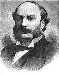
Discovering Argon with the 2-Sample t-Test

March 11, 2013
By
Discovering Argon with the 2-Sample t-Test

I learned about Lord Rayleigh’s discovery of argon in my 2nd-year analytical chemistry class while reading “Quantitative Chemical Analysis” by Daniel Harris.  (William Ramsay was also responsible for this discovery.)  This is one of my favourite stories in chemistry; it illustrates how diligence in measurement can lead to an elegant and surprising discovery.  I find […]

Read more »

Adding Labels to Points in a Scatter Plot in R

March 2, 2013
By
Adding Labels to Points in a Scatter Plot in R

What’s the Scatter? A scatter plot displays the values of 2 variables for a set of data, and it is a very useful way to visualize data during exploratory data analysis, especially (though not exclusively) when you are interested in the relationship between a predictor variable and a target variable.  Sometimes, such data come with categorical […]

Read more »


Subscribe

Email:

  Subscribe