
Although R is great for quickly turning data into plots, it is not widely used for making publication ready figures. But, with enough tinkering you can make almost any plot in R. For examples check out the flowingdata blog or the Fundamentals of Data Visualization book.
Here I show five charts from the lay press that I use as examples in my data science courses. In the past I would show the originals, but I decided to replicate them in R to make it possible to generate class notes with just R code (there was a lot of googling involved).
Below I show the original figures followed by R code and the version of the plot it produces. I used the ggplot2 package but you can achieve similar results using other packages or even just with R-base. Any recommendations on how to improve the code or links to other good examples are welcomed. Please at to the comments or @ me on twitter: [@rafalab](https://twitter.com/rafalab).
Example 1
The first example is from this ABC news article. Here is the original:
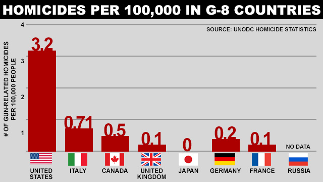
Here is the R code for my version. Note that I copied the values by hand.
library(tidyverse)
library(ggplot2)
library(ggflags)
library(countrycode)

dat <- tibble(country = toupper(c("US", "Italy", "Canada", "UK", "Japan", "Germany", "France", "Russia")),
              count = c(3.2, 0.71, 0.5, 0.1, 0, 0.2, 0.1, 0),
              label = c(as.character(c(3.2, 0.71, 0.5, 0.1, 0, 0.2, 0.1)), "No Data"),
              code = c("us", "it", "ca", "gb", "jp", "de", "fr", "ru"))

dat %>% mutate(country = reorder(country, -count)) %>%
  ggplot(aes(country, count, label = label)) +
  geom_bar(stat = "identity", fill = "darkred") +
  geom_text(nudge_y = 0.2, color = "darkred", size = 5) +
  geom_flag(y = -.5, aes(country = code), size = 12) +
  scale_y_continuous(breaks = c(0, 1, 2, 3, 4), limits = c(0,4)) +
  geom_text(aes(6.25, 3.8, label = "Source UNODC Homicide Statistics")) +
  ggtitle(toupper("Homicide Per 100,000 in G-8 Countries")) +
  xlab("") +
  ylab("# of gun-related homicides\nper 100,000 people") +
  ggthemes::theme_economist() +
  theme(axis.text.x = element_text(size = 8, vjust = -16),
        axis.ticks.x = element_blank(),
        axis.line.x = element_blank(),
plot.margin = unit(c(1,1,1,1), "cm")) 
Example 2
The second example from from everytown.org. Here is the original:

Here is the R code for my version. As in the previous example I copied the values by hand.
dat <- tibble(country = toupper(c("United States", "Canada", "Portugal", "Ireland", "Italy", "Belgium", "Finland", "France", "Netherlands", "Denmark", "Sweden", "Slovakia", "Austria", "New Zealand", "Australia", "Spain", "Czech Republic", "Hungry", "Germany", "United Kingdom", "Norway", "Japan", "Republic of Korea")),
              count = c(3.61, 0.5, 0.48, 0.35, 0.35, 0.33, 0.26, 0.20, 0.20, 0.20, 0.19, 0.19, 0.18, 0.16,
                        0.16, 0.15, 0.12, 0.10, 0.06, 0.04, 0.04, 0.01, 0.01))

dat %>%
  mutate(country = reorder(country, count)) %>%
  ggplot(aes(country, count, label = count)) +
  geom_bar(stat = "identity", fill = "darkred", width = 0.5) +
  geom_text(nudge_y = 0.2,  size = 3) +
  xlab("") + ylab("") +
  ggtitle(toupper("Gun Murders per 100,000 residents")) +
  theme_minimal() +
  theme(panel.grid.major =element_blank(), panel.grid.minor = element_blank(),
        axis.text.x = element_blank(),
        axis.ticks.length = unit(-0.4, "cm")) +
coord_flip() 
Example 3
The next example is from the Wall Street Journal. The original is interactive but here is a screenshot:

Here is the R code for my version. Note I matched the colors by hand as the original does not seem to follow a standard palette.
library(dslabs)
data(us_contagious_diseases)
the_disease <- "Measles"
dat <- us_contagious_diseases %>%
  filter(!state%in%c("Hawaii","Alaska") & disease == the_disease) %>%
  mutate(rate = count / population * 10000 * 52 / weeks_reporting)

jet.colors <- colorRampPalette(c("#F0FFFF", "cyan", "#007FFF", "yellow", "#FFBF00", "orange", "red", "#7F0000"), bias = 2.25)

dat %>% mutate(state = reorder(state, desc(state))) %>%
  ggplot(aes(year, state, fill = rate)) +
  geom_tile(color = "white", size=0.35) +
  scale_x_continuous(expand = c(0,0)) +
  scale_fill_gradientn(colors = jet.colors(16), na.value = 'white') +
  geom_vline(xintercept = 1963, col = "black") +
  theme_minimal() +
  theme(panel.grid = element_blank()) +
        coord_cartesian(clip = 'off') +
        ggtitle(the_disease) +
        ylab("") +
        xlab("") +
        theme(legend.position = "bottom", text = element_text(size = 8)) +
        annotate(geom = "text", x = 1963, y = 50.5, label = "Vaccine introduced", size = 3, hjust=0)
Example 4
The next example is from the New York Times. Here is the original:

Here is the R code for my version:
data("nyc_regents_scores")
nyc_regents_scores$total <- rowSums(nyc_regents_scores[,-1], na.rm=TRUE)
nyc_regents_scores %>%
  filter(!is.na(score)) %>%
  ggplot(aes(score, total)) +
  annotate("rect", xmin = 65, xmax = 99, ymin = 0, ymax = 35000, alpha = .5) +
  geom_bar(stat = "identity", color = "black", fill = "#C4843C") +
  annotate("text", x = 66, y = 28000, label = "MINIMUM\nREGENTS DIPLOMA\nSCORE IS 65", hjust = 0, size = 3) +
  annotate("text", x = 0, y = 12000, label = "2010 Regents scores on\nthe five most common tests", hjust = 0, size = 3) +
  scale_x_continuous(breaks = seq(5, 95, 5), limit = c(0,99)) +
  scale_y_continuous(position = "right") +
  ggtitle("Scraping By") +
  xlab("") + ylab("Number of tests") +
  theme_minimal() +
  theme(panel.grid.major.x = element_blank(),
        panel.grid.minor.x = element_blank(),
        axis.ticks.length = unit(-0.2, "cm"),
        plot.title = element_text(face = "bold"))
Example 5
This last one is from fivethirtyeight.

Below is the R code for my version. Note that in this example I am essentially just drawing as I don’t estimate the distributions myself. I simply estimated parameters “by eye” and used a bit of trial and error.
my_dgamma <- function(x, mean = 1, sd = 1){
  shape = mean^2/sd^2
  scale = sd^2 / mean
  dgamma(x, shape = shape, scale = scale)
}

my_qgamma <- function(mean = 1, sd = 1){
  shape = mean^2/sd^2
  scale = sd^2 / mean
  qgamma(c(0.1,0.9), shape = shape, scale = scale)
}

tmp <- tibble(candidate = c("Clinton", "Trump", "Johnson"),
              avg = c(48.5, 44.9, 5.0),
              avg_txt = c("48.5%", "44.9%", "5.0%"),
              sd = rep(2, 3),
              m = my_dgamma(avg, avg, sd)) %>%
  mutate(candidate = reorder(candidate, -avg))

xx <- seq(0, 75, len = 300)

tmp_2 <- map_df(1:3, function(i){
  tibble(candidate = tmp$candidate[i],
         avg = tmp$avg[i],
         sd = tmp$sd[i],
         x = xx,
         y = my_dgamma(xx, tmp$avg[i], tmp$sd[i]))
})

tmp_3 <- map_df(1:3, function(i){
  qq <- my_qgamma(tmp$avg[i], tmp$sd[i])
  xx <- seq(qq[1], qq[2], len = 200)
  tibble(candidate = tmp$candidate[i],
         avg = tmp$avg[i],
         sd = tmp$sd[i],
         x = xx,
         y = my_dgamma(xx, tmp$avg[i], tmp$sd[i]))
})

tmp_2 %>%
  ggplot(aes(x, ymax = y, ymin = 0)) +
  geom_ribbon(fill = "grey") +
  facet_grid(candidate~., switch="y") +
  scale_x_continuous(breaks = seq(0, 75, 25), position = "top",
                     label= paste0(seq(0, 75, 25), "%")) +
  geom_abline(intercept = 0, slope = 0) +
  xlab("") + ylab("") +
  theme_minimal() +
  theme(panel.grid.major.y = element_blank(),
        panel.grid.minor.y = element_blank(),
        axis.title.y=element_blank(),
        axis.text.y=element_blank(),
        axis.ticks.y=element_blank(),
        strip.text.y = element_text(angle = 180, size = 11, vjust = 0.2)) +
  geom_ribbon(data = tmp_3, mapping = aes(x = x, ymax = y, ymin = 0, fill = candidate), inherit.aes = FALSE, show.legend = FALSE) +
  scale_fill_manual(values = c("#3cace4", "#fc5c34", "#fccc2c")) +
  geom_point(data = tmp, mapping = aes(x = avg, y = m), inherit.aes = FALSE) +
geom_text(data = tmp, mapping = aes(x = avg, y = m, label = avg_txt), inherit.aes = FALSE, hjust = 0, nudge_x = 1) 